parting it out

I wrote this book about graphic design. Check it out here.
I wrote this book about graphic design. Check it out here.

I have a new essay in Slanted #25, the Paris issue.

Within, I talk about museums, shoplifting, puberty and art.

I also talk about my dear ol’ dad.

I have an story in issue #24 of Slanted, an issue devoted entirely to Istanbul, Turkey.

Istanbul – the city on the Bosphorus – is famous for its countless minarets, magnificent palaces, colorful markets and traders, seagulls and stray cats. Istanbul is the only metropolis in the world that unites two continents. Traditional crafts collide with a young and blossoming art and design scene, which is slowly changing the face and image of the city.

Slanted takes a close-up look at contemporary design work and all the tumultuous developments in this cultural melting pot city balanced between the Orient and the Occident. On their one-week-trip the Slanted team met 15 design studios and produced comprehensive studio portraits which provide a vivid and up-to-the-minute picture of the scene. Thanks to Augmented Reality and the Junaio app, readers can easily watch embedded videos of the Istanbul turu on mobile devices.

The story I contributed is called “The Martyrdom of Ivram Islander” and is the tale of the future of a world where both humankind and graphic design education are in stasis—a form of suspended animation that pervades culture as much as is representative of it. The story is part graphic design criticism and part science fiction.

An excerpt:
Evrim Aslaner was listening to a collection of murky live recordings of a seminal, late-1980s hardcore band from the American Midwest via headphones on the crosstown train. Some songs were clearer than others, though the differentiation was marginal at best. It was obvious that none of the recordings utilized the mixing boards at the VFW Halls and crappy, tiny venues where they were recorded—perhaps just a handheld tape recorder, or on the more clear ones, a condenser mic, fed into a tape recorder precariously situated in the back of whatever club a fledgling promoter had happened to acquire for the night, 130 years ago and on the other side of the world.
The sound itself was a vaguely polyrhythmic, distorted dirge — all low-end rumble with the occasional Skexis-like feedback squeal overriding momentarily. The vocals—a muffled, staccato Chewbacca-esque cadenced war rant — were delivered unintelligibly, though with the mealy mouthed venom of so many young men of that bygone age that Evrim was currently fascinated with. The only clearly identifiable instrument was the reverberating crash cymbal, the rest was reduced to a two-minute-long semaphore-like aural wet fart of dissonance and rumble.
Evrim’s immersion in the dense music was sharply interrupted by a figure entering the hovertram at the Bestiktas Square stop. Anyone at all riding the hovertram was an anomaly these days. Same with the library. Ditto for the food vendroid stands. The last of the humans, still venturing out-of-doors, were trickling out. Good weather, civic events, “live” music, none of these drew more than a handful of malcontents anymore. That being said, Evrim was continually surprised that the city’s hovertram continued to run—one of the last remaining symbols of the final administration’s promise that auto-piloted public transport would run 24 hours a day for the rest of eternity, with no need for cleaning, maintenance or repairs. He was glad it hadn’t stopped; without it, he’d be forced to sullenly walk halfway across Istanbul to the library.
This was the third time that Halil Ergün’s facsimile had gotten on the same train as Evrim. It was weird. When the previous administration had deployed its convoy of cyborg replications of movie stars, television personalities, and other historical figures of note, they were wildly popular with the then-ambulatory populace for a few months, but quickly fell from prominence. When members of the human public asked the replicas of the stars about their inner feelings, the cyborgs would quip something nonsensical or re-quote a well-known snippet of history. It became obvious that their personalities were merely cross-indexed databases of suggested behaviors, based on their media personas, not the original stars’ true personalities. It didn’t help that their “faces” were internally projected in a Tony Oursler-esque fashion within their ovoid heads much, either. Real people found that they had little to gain from the simulacra, most already being innately familiar with retro culture due to telechip implants. Otaku-like super-fans were able to stump the cyborgs by grilling them with intense amounts of trivia and barrages of detailed questions about covert activities of the stars’ lives that occurred during their original, wholly organic incarnations.

Limited edition English-only booklet of my essay “The Defensible Position” about conceptual approaches to art and design, published in three colored editions for the CalArts X Kookmin workshop at Kookmin University in Seoul, Korea. Bilingual version coming soon.

I have an essay published in the book Creators’ Bookmarks 2 published by G Colon in Korea.

The essay is about desks, most notably the desks where I work.

An excerpt:
“I used to hack out ‘zines from a desk under my loft bed in Oakland, California. I had a really nice, expansive work area in an apartment in Portland, Oregon the first time I lived alone. I had another one in Shibuya a few years ago. I’ve had a lot of shitty desks between the two—dank ones in Los Angeles and Portland; cold, unfeeling ones in New York; bright and airy desks in Berkeley and Los Angeles. It’s a never-ending parade of places where I’ve worked.
But the ones where I’ve done my best work are the ones that were not desks at all—a lawn chair on a veranda and a family restaurant table, both in Tokyo, accompanied by sunshine and by really bad pizza (and never-ending refills). To fetishize the physical environs of the graphic design studio is to do it a disservice—most designers I know do not own their own homes. Their work areas are temporary—either at employers’ offices or in rented or leased properties. These are not the liminal spaces of dreams—they are the raw concrete of limited means.
It’s an affront when we see the neat and tidy white-painted concrete box offices that are flouted in Graphic Design documentaries like Helvetica and in books like Unit Editions’ Studio Culture. The lone office semi-worth working in that I have spied via widely-disseminated media to date is Geoff McFetridge’s studio in the film Beautiful Losers. Why? Because it was a mess. It speaks of the nature of humanity and not trying to fit into the mold of wannabe-architects’ tidy Modulor boxes. That’s where I live and where I want to live.”

I have an essay called “The Empire of Grey” in issue #23 of Slanted. This issue is all about Swiss typography. An excerpt:
In the introduction to the classic book Empire of Signs by Roland Barthes, the author summons forth a fictive landscape of signs and symbols without tangible connection to meaning within. It is a country where sign and meaning are divorced. A place whose language consists of intimation and suggestion, but never direct articulation—it is layers of overlaid shifting gauze of semiotic mystery and displacement in the stead of the absolute. He then goes on to name the place “Japan”. Within the book, he is both talking about the nation state of Japan and about the “Japan” that exists in his mind (as well as, in particular in the introduction to the book, an imagined, fictive other place which just happens to be saddled with the moniker “Japan”).
It’s both the second and third versions of “Japan” in this book that interest me, especially in the context of this essay—a place that as a global community, we retain a series of impressions of, stereotypes toward, and collective ideas about, even if we have never visited that place.While Japan may be exceedingly important to people studying semiotics and young people across a strata of interests across the world seeking their “otaku moment”, there is another simultaneously fictional and very, very real place that is firmly rooted in the minds of graphic designers… I name this place “Switzerland”.

I contributed an essay to the book 20th Century Editorial Odyssey compiled by Yuichi Akata and Barbora, collecting their writings on the development of the 20th Century subculture-focused independent press which was just published by Seibundo Shinkosha. The book is an amazing guided tour through some of the most engaging publications of the past 100 years including The Whole Earth Catalog, The Picture Newspaper, Now, Heaven, Zoo, and many, many more. From hippie magalogs to punk zines to high fashion glossies to doujinshi, the book charts a unique course through active readership and its affect on culture.

My essay focuses on Wet, the “Magazine of Gourmet Bathing”, published and steered by Leonard Koren in the 1970s and 1980s. It was previously published in Idea #352.

Poster Collection 26: Japan – Nippon, a book I spent a significant amount of time working on as a co-editor is out now.

Published by Lars Müller, it’s a 112-page book with tons of images of Japanese posters from the early Modern period through today, plus a great essay by Kiyonori Muroga of Idea.

Spectra, a book featuring the work of the CalArts GD classes of 2013, is out now. What follows is text culled from the official press release:
Released in January 2014, Spectra, a slim, fluorescent volume, is the first comprehensive collection of student work from California Institute of the Arts (CalArts) Graphic Design Program in over a decade. Spectra showcases the work of CalArts’ Graphic Design class of 2013. Representing a range of values along more than one continuum—from print to electronic media, personal work to collaborative efforts—the work displays a fluidity between concept-driven and formal solutions.

Spectra’s co-editor Benjamin Woodlock comments on the concept behind the publication. “Whereas a single spectrum describes a smooth path with infinite values in between, the geometry of many is flecked with intersections that are distinct points of reference. Spectra examines these nodes, suggesting threads that run through individual bodies of work as well as well as the work of the Graphic Design Program as a whole.” Adds co-editor Sarah Faith Gottesdiener, “We wanted to give the world a look into our program as a whole, as well as document work produced under the tutelage of noted faculty member, Ed Fella, who retired from teaching this year.”

The publication features a one part honest, one part depressing, one part inspirational introduction essay from noted Graphic Design Program alumnus Ian Lynam, who currently lives and works in Tokyo. Current faculty Lorraine Wild and Gail Swanlund also contributed essays.

Spectra uses typefaces by CalArts alumnae Jens Gehlhaar and Andrea Tinnes. The book was designed and edited by recent MFA grads Sarah Faith Gottesdiener and Benjamin Woodlock.

The book will be for sale at the LA Book Fair, January 31st to February 2nd at the Leisure Labor Table (run by CalArts Graphic Design alums Laura Bernstein, Scott Massey, and Masato Nakada).

Limited edition copies can be purchased for $15 + shipping starting in February by contacting Sarah.gottesdiener@gmail.com.

I wrote an essay about Tokyo graffiti was published in the book, The World Atlas of Street Art and Graffiti. The book was published by Quarto and Yale University Press.

An expanded version of my essay “Japanese Graphic Design: Not in Production” was published over at Modes of Criticism.

Idea Magazine #360 features a 96-page feature that I edited, designed and wrote big chunks of.

For a week, Idea Editor-in-Chief Kiyonori Muroga and I stayed in Valencia, the home of CalArts, to “work on a design research/writing/making/collecting/documenting project about CalArts itself, it’s history, it’s current state, ephemera, and researching in a very open way”, making CalArts both the laboratory and the subject.

The results is an image-rich look at the past few generations of CalArts alumni, the work of faculty and related projects.

Included is work by Ed Fella, Lorraine Wild, Mr. Keedy, Caryn Aono, Scott Zukowski, Silas Munro, Tasheka Arceneaux-Sutton, Mark Kulakoff, Corey Holms, Jon Sueda, Geoff McFetridge, Megan McGinley, Max Erdenberger, Brian Roettinger, Scott Massey, Andrea Tinnes, Tim Belonax, John Wiese, Jae Hyouk-Sung, Micah Hahn, Michael Worthington, Gail Swanlund, Louise Sandhaus, and many, many others.

The feature is crammed to the gills with bilingual essays and interviews.

You can pick up a copy here.

When I heard that Experimental Jetset were working on the new identity for the Whitney, I joked to my friend, coworker and (post-subculture, yet subcultural-seeming) bandmate Thien that I knew what it was going to look like:
“They’re just going to throw out some Helvetica and something insipid, probably a W.”
Thien said “no way”, and bet me a beer that “nobody would do something as stupid as that, even those dudes”.
I drank a frosty beer on a certain young man with high expectations’ tab in the Shin Okubo area of Tokyo two days ago and thought about the fact that its almost impossible to write something that spells out how awful EJ’s redesign is, because it is just. So. Fucking. Obvious… but people love obvious these days. It looks fresh. Clean. Akin to Michael Bierut’s comments about (paraphrased) “getting rid of the fussy old stuff and just having some big Helvetica spelling out two words: ‘Drink. Coke.'”
I grew up in New York State in the 70s and 80s – the “Drink. Coke.” era. Seeing stacked Helvetica everywhere was mind-numbingly boring. When I turned 9 years old, my parents took me on a stroll through the city and we spent the day walking, just poking around. Our meanderings brought us through much of Manhattan, eventually crossing paths with Chermayeff & Geismar’s iconic numeral nine situated in front of 9 West 57th Street. My parents asked me to stand in front of it – a serendipitous celebration of the 9 years on earth that I’d spent so far. I frowned, glowered, kicked at the half-inch steel exoskeleton of that nine and denied any association with it.
It’s one of those things I viscerally feel and remember: making a giant number nine to represent a building that was number nine was fucking stupid, and to try to sell that to me on my ninth birthday, equally so. However, apparently that big nine is iconic these days, or at least so it says on the C&G website, but I’ve always felt that it is dumb. Dumb, as in obvious. Dumb as in hackneyed. Dumb as in easy. Dumb as in crappy. Dumb as in pandering and ultimately un-redeeming.
And sure, it’s not Helvetica, that “9”, but apparently neither is Neue Haas Grotesk, but that is what they both are, ultimately, and the palette has already been cleaned of the ‘fussy old stuff’.
THE LINE
“Unfolding the line”, the title of EJ’s explanation of their new “W” mark family, ties in perfectly with the move to the entrance to the High Line – a ‘line’ and a Line: the ultimate synergy. EJ has stated that their flat W is “the line as a graphic agent of systems (and of anti-systems), as a signifier of modern art, as a sketch of things-yet-to-come, as a diagrammatic device, and as a representation of lineage (and thus of heritage)”.
This bit of their identity manifesto (in convenient, print-on-demand format) literally means nothing. Or everything. Or a banana. Or a tugboat. Or a banana tugboat. It’s the ultimate end-all, be-all affirmation/negation of meaning – be it temporal, spatial or sensical. It makes me want to punch myself in the head, because it is so easy to make dubious, reductive graphic design and I just make it hard on myself by wanting to see design work out in the world that has some complexity and just something more to it.
Also, it is not a line. It is a W. Gluh. Point line plane. It’s a few lines. Together. Making a W.
A NOTE ON THE TYPE
EJ’s comment on their approach to the typographic aspect of the Whitney identity is interesting, as it belies much of their sensitivity as typographers, “(Neue Haas Grotesk) comes in an enormous variety of weights and styles (from Extra Thin to Black), both as ‘display’ and ‘text’ variations. Because the redrawn version was originally intended as a newspaper typeface, it is designed as a fully functional font, with many alternate characters and numbers. However, for the word ‘Whitney’ (as well as the accompanying headings, titles and names), we have chosen to use only uppercase type (and in one particular weight as well).” This is of little surprise – EJ are the masters of the ultra-reductive palette, plus Americans don’t read anyway. The “typographic palette” is akin to walking into a Michelin-rated restaurant and ordering spaghetti with butter.
The thing that is really striking, however, is the desire of the designers to be associated with subcultures. This comes up a few times in the essay – they have chosen a redrawing of Helvetica because it reifies the museum’s position by aligning their identity (and ultimately, Experimental Jetset) with “No Wave, Conceptual Art, New York Punk, the downtown loft scene of the ’70s, and other subcultural phenomena”. Later in their project description, they mention the “‘DIY’-ideology of our studio”, which again strikes a chord: Experimental Jetset thinks that they are punk. Or hardcore. Or just simply: other.
I reckon that EJ have ultimately nothing to do with anything “other” – by invoking this term, I refer to a system of subcultural ideologies that is decidedly not status quo in nature, or at least was purported to be “back in the day”. The “other” was the fringe, the odd, the weird, the eccentric and the atavistic. The happy-go-lucky co-optation of DIY musics into consumer products that EJ has flogged to apparel manufacturers, notably their “Black” tee shirt design referencing the “Big 3” of heavy music (Black Flag, Big Black and Black Sabbath) have widespread appeal in that the genres of punk/hardcore, noise, (pre-)post-rock and stoner metal (and by association sludge and black metal) – some of the only logical choices for musics that have the appearance of being ‘anti-social’ in contemporary circles. (That this has been shored up in banana/tugboat tactics by making a Beatles tee shirt is exemplary of their ultimately totalitarian way of approaching culture. Their past appropriation of black metal imagery for their “Modernism” tee shirt is another example of cultural riffage that yet has no meaning beyond surface. It is akin to the early 90s rave/ovoid skateboard revolution logo spin, the working methodology kept alive most prominently by Shepard Fairey.)
There is nothing ultimately additive to the work of Experimental Jetset. They can be quotidian, but merely that. There is no there there. It neatly mirrors corporate American Modernism because it is the look of Modernism without the underlying prosocial intention.
Experimental Jetset invoke the ghosts of subculture to lend their work the aura of authenticity, yet do nothing interesting with it, much less anything truly content-based. Their work is all a gauzy veil of assured knowing – the cool guy or girl propping up the bar and nodding approvingly, yet whom has nothing of interest to say. As a Twitter-flattened global culture, we denizens of Earth are so infatuated with ‘authenticity’ that ultimately, we have forgotten about what is more important: quality.
SOMERY
Overall, my issue with this design, much like most of EJ’s design is that it is formulaic, simplistic, trite, and ultimately: banal.
Also, a W is not a grid. It’s a W.
(This mini-essay was generated initially as a comment to Francisco Laranjo’s essay on Design Observer “The Whitney Identity: Responding to W(hat)?” regarding the redesign of the identity for the Whitney Museum, but ran longer than the original post, so is published here instead.)

I have an essay in Letterseed 201306, the journal of the Korean Society of Typography called “Work In Progress” about the transitory nature of design research, the proliferation of retrograde aesthetics and the cult of the Risograph.
This issue of Letterseed includes other writing by Ahn Sang-soo, Chris Ro, David Cabianca, Jae-joon Hahn, Hyun Cho, Jiwon Lee and others.

I have an essay in Slanted #21 about Cuba and Cuban graphic design, as well as a feature of Cuban street photography by myself and Andrea Tinnes shot in Havana and Trinidad. It is called “The Human Memory Machine”.
An excerpt:
Like most humans, I have forgotten far more than I will ever remember. Our memories are akin to series of short films or a highlight reel – tedium has to be tremendous in scale for us to recall it. We are probably lucky for this – the hours lost to bureaucracy, waiting in lines, waiting in traffic, waiting on others, et al. We retain only the highlights of our lives – the first kisses, the extreme violence, the romance, the pain and the embarrassing.
In December of 2011, my wife and I took a belated honeymoon in Cuba and Mexico, a week in Cancún with a week in Cuba sandwiched smack dab in the middle. Like all vacations, I retain only glimpses of my time in Cuba – a few hundred memorable scenes hard-cut together. If I were to catalog this time, it’d include these key scenes by way of example:
– Visa anxiety as I waited to go through customs in Mexico. Americans still aren’t allowed to go to Cuba, other than by obtaining a special visa for educational or relief purposes. I’d paid a tariff to have an extra signature of pages put into my passport so that no Cuba immigration stamp would land in my passport.
– The anticipation of fuselage smoke in the Cuba Air shuttle plane that never emerged.
– A sign outside a Havana discotheque which read “Tourists will be assaulted here” in Spanish.
– Strolling through a warehouse full of vegetables, fruits and tubers from organopónicos, urban organic farming stations that criss-cross Cuban cities – the gardens an answer to the lack of support from the fallen Soviet Union in the new century.
– A dog gnawing the skull of another dog in Trinidad.
– Sitting on a beach chair sipping rum next to the ocean in Playa Ancon tapping out an essay for Slanted on my phone while my wife, clad in a turquoise and salmon-colored bikini, takes hundreds of photos of the reflected surface of the ocean in a vain attempt to capture the beauty of the fish nibbling at the dead skin in her feet.
– Being asked for money by new Cuban acquaintances and complying.
– Being asked for money by new Cuban acquaintances and refusing.
– Being sick of being asked for money and instead asking new Cuban acquaintances for money, cutting them off at the pass.
– Chatting with a guard outside of a Havana cigar factory, plumbing the depths of my high school Spanish language education.
– Meeting a farmer who is the spitting image of Ronald Reagan on the side of a highway, a package of cane sugar candy in his outstretched palm crawling with fire ants.
– An extra-malty bottle of beer with a polar bear on the label downed while walking Havana’s back streets, it hitting the spot in a way that few drinks do.
– An unofficial taxi driver telling I and the three other tourists in the car from Havana to Trinidad how much more money he makes on these quasi-legal trips than pursuing his regular work as an emergency room surgeon.
– Chatting with a young man with a PhD in finance and who was fluent in English, German, French and Mandarin about his most rewarding employment option: working in his grandfather’s gift shop selling wicker knick-knacks.
– Illicitly watching some members of the Buena Vista Social Club make their way through their repertoire of music on-stage through the window of a nightclub from the street.
– Days of walking across Havana, taking in the general streetscape, photographing signage as we traversed the city.
This particular scene is the one that will have the most resonance with Slanted readers – documenting vernacular signage has become a collective pastime for designers over the past number of years, codified as much in print (Ed Fella’s Letters on America) as on-screen (Instagram). Designers shoot photo after photo of sign after sign, but often take little notice of the socioeconomic environment that brings may examples of signage to life. This is what makes the signage of Cuba such an amazing repository of inspiration – the years of economic embargo, an economy flooded with products from Soviet-allied nations and a dearth of American brands, complemented by an economy that limped along in the 1990s. The Cuban experience is so utterly singular in the contemporary global scheme that it must be noted, particularly in the realm of graphic design…
I wrote and designed a monograph about the work of graffiti writer/fine artist Jerry Inscoe, also known as Joker, a number of years ago, though it never saw print. What follows is an essay about his work from 2002 that was meant to kick off the book.

Graphic Transcendence
Jerry Inscoe’s work is rigorous, intelligent, poised, and assured — the evidence of extensive formal exercise. It’s obvious that he has been working away at what he does for a long time, much of it under the graffiti nom de plume Joker. He flattens the ordered rationality of extruded volumetric masses, inverting architectonic norms for his own graphic purposes. Inscoe works in pop color schemes, twinning them with fields of neutral colors, alluding to the emotionlessness and anonymity of the mechanical as contrasted with the bright-hued green-yellows and magentas he often brings into play. His work is a model for cross-media practice, each channel encouraging interchange between the assorted aspects of his work. Inscoe’s explorations are studies of structures in tension, exploiting the relationship between line and mass. A constantly evolving vocabulary of geometric form balances elegance with heroism. This inquiry into the collision of the facade and the void calls into question concrete expressions and functions- complex and simplified contour lines interweave and contain one another in unpredictable variants. The work is imbued with a nonlinear, yet defined sense of place- visual orthography gone haywire and transformed into a there. His darker pieces are akin to witnessing a great transgression or to a purifying, boundary-exploding ascendance.
Inscoe was a Washington D.C. graffiti pioneer. His early work is well documented in Roger Gastman’s Free Agents: A History of Washington DC Graffiti. Skateboarding was what initially sparked his romance with graffiti, a Powell Peralta ad setting the earliest of stylistic models until he came across copies of the classics Subway Art and Spraycan Art shortly thereafter. He incorporated these influences and was soon one of the ten people actively writing graffiti in D.C. in the late 80s. After high school, Inscoe moved almost annually due to school and work, with stops in Fort Lauderdale, Pittsburgh, Tulsa, Livermore, California, San Diego, and Berkeley. His travels stopped in 1995 when he settled in Portland, Oregon, his current home.

As Inscoe moved from city to city, his work evolved and matured, shifting from the early New York-influenced models to a more abstract and idealistic take on what graffiti could be. He synthesized aspects of his undergraduate design education and influence from myriad influences into his work. Collaborative drawings with San Francisco’s Raevyn were a big point of departure. Their projects were undertaken under the premise of image-making and abstraction, approaching the work from a vantage point opposite of graffiti done for graffiti’s sake. The pair would blindly scribble on paper, and then trade scrawls, with the intention of making paintable pieces out of the scribbles, or alter electrical engineering plans to construct lettering. These exercises, as well as trading outlines for pieces with New York legend Phase Two (originator of both the graffiti bubble letter and the use of decorative ornamental arrows alongside graffiti lettering) and Transcend co-founder Karl123 infused Inscoe with the desire to create highly original work that did not conform to the aesthetic standards of traditional graffiti.
Deconstructivist architecture was a giant influence, in particular, the drawings and renderings of Iranian-born British architect Zaha Hadid. Inscoe’s work is itself a formal extension of the Deconstructivist outpouring of the last twenty years- a reaction to more typical graffiti artwork in which three-dimensional lettering is rendered. Reacting to the work of writers like Erni, Delta, Zedz, and Daim, Inscoe inverts, decompiles, and reassembles three-dimensional space, reducing and abstracting: lines and arcs massing and converging with gothic insidiousness, defying isometric and axonometric mores, postmodern typographic elements, tribal angularity, and more typical NY-influenced wildstyle lettering with the occasional droopy-eyed character come into play in Inscoe’s work, as well, though they often take the back seat to his spatial constructions.

As Inscoe’s work has evolved, he has simultaneously worked in numerous fields outside of writing. He has created best-selling apparel graphics for companies such as Nike, Tribal, Upper Playground, Osiris, Scion, Fity24SF, and others. Inscoe designed a signature Joker shoe model for Savier shoes and those designs are presented here for the first time. Inscoe collaborated with designer Cody Hudson/Struggle Inc on an expressive line of snowboards for Burton that feel straight out of his sketchbook, meshing ink drawings and watercolor fills.
Inscoe has also collaborated with the type foundry Handselecta to create a family of typefaces derived from his handstyle– inspired by architectural and comic book lettering. Using copious writing samples provided by Inscoe, type designer Christian Acker digitized and regulated Inscoe’s handstyle into light, medium, and bold weight typefaces. These fonts were produced in three formats- a regular weight utilizable for default typesetting and two swash options that include numerous alternate characters.
Along the way, Inscoe has always had a strong group of collaborators. One of his crews, BA (Burning America) was started by his old friend Jase, a writer from Baltimore infamous for his enormous output of graffiti on freight train cars (to date over 40,000 pieces painted). BA is one of the most innovative and formidable crews in the world. The roll call is a who’s who of graffiti veterans: Sope, Felon, Misk, Are2, Rust, Atom, Blis, Cha, Myth, Insight, Take5, Con, Wild, Apex, Neon, Giant, Cycle, and twelve others. It is precisely that because the crew is geographically disparate and stylistically so very diverse that makes them such an interesting group. More than a few of the individuals involved have made the leap from street art to gallery art, as well. Writers like Rust, Misk, Cycle, and Mike Giant exhibit internationally on a regular basis.

Another of his crews, Transcend, is an idealistic attempt to abandon the traditional graffiti crew and return to the model of the artistic collective. Traditionally, crews are organized groups of graffiti writers linked by geography and/or stylistic similarity who work collectively. Painting, sketching, obtaining supplies, and other graffiti-centric activities are often done as a group. Crew activity tends to be aimed at promotion and propagation of writing among peers, but does not extend into other realms of visual expression. Transcend veers from this path in it’s past and present inclusion of non-writers, as well as the group’s collective and individual forays into other media, as well. Members whose focus lies in different fields have included an architect, a poet, and a designer in the past. Currently, Anna, a photographer, is the only non-writer involved. As far as writers go, Inscoe’s longtime collaborator Persue, is a shoe designer for Osiris Footwear, as well as a graphic designer, illustrator, and owner of the BunnyKitty line of products. Kema works as a graphic designer, and SheOne does logo work for Ninja Tune Records, as well as other companies. The collective works together on commercial projects, exhibitions, and book projects.
Inscoe’s collaborative zine with Mike Giant, Snothatch, is a mix of collaborative drawings done by the two writers published via the Skullz Press imprint. Giant and Joker utilize only a Sharpie marker for a whole volume, with no penciling to guide them. The zine is an inquiry into the exploration of the blackbook, not sketches for future murals. The volume is of an exquisite corpse-nature and is done with a sense of humor, play and collaboration. Giant’s lettering is homage to classic NYC graffiti form, with a Los Angeles slickness to it. Giant’s work is rooted in constant references to older forms of lettering– barrio calligraphy, sign painting scripts, and grunge typography are all recontextualized. The bubbly shapes of his lettering suggest old supermarket window lettering and American commercial art. Giant worked for years as a graphic designer for assorted skateboard companies, and his familiarity with type is obvious. He currently works as a tattoo artist and many seek out his lettering work out, as it is formally elegant and balanced. Giant’s work is steeped in Americana, and pointedly so. It makes for an interesting counterpoint to Inscoe’s angular, severe, and more clinical work- as if one of Frank Gehry’s seemingly chaotic and massive exploded spaceship hulls were to make an emergency crash landing in a bordertown.
Where Inscoe is headed is unknown- his work is continually being published as well as exhibited internationally. It is assured that he will keep alive the process of discovery in new works, as well as explorations in other media. His subversion of conventional perception of space will no doubt further and deepen. As for others’ perception of Inscoe, with luck, that will expand, as well.
I wrote this brief essay for an impromptu exhibition I had at VCFA of assorted posters I’ve made over the past few years in 2012.

Life is not tidy. Every individual is constrained by the expected hours of their day that comprise their life. If you are interested in writing, you must make the time to write. If you seek to do engaging design projects outside of commercial or cultural practice, you must make the time to cultivate that practice.
Since 2009, I have made it a point to create one poster every 90 days, print 1000 copies to 5000 copies, and distribute them freely throughout Tokyo. These posters, constrained to A3 – an industrial format comparable to 11″ X 17″ in the United States (an odd and idiosyncratic format that does not fit with the International Standards Organization’s proscribed international paper size formats) – have been created outside of the boundaries of typical practice.
They are design without clients. A URL and series number are included for cataloging purposes, not for promotion. The series has included a widespread attempt at sampling the vernacular of Japanese commercial art, ranging from outright theft and re-assemblage of imagery to mimicry of indigenous forms of Japanese modern design to cultural critiques, herein represented in the narrow range of spiritual beliefs of cult-like belief systems that have been widespread throughout Japan.
This is a very limited sampling of what has been created over the past five years. They are here for you to take freely and use as you will.
Graphic Design has experienced an insurgence of the popularization of dated reprographic technology, notably the Risograph, a relatively small-scale printing system that utilizes stencil-based printing in lieu of more common photocopier technology.
The Risograph is a Japanese product manufactured by the Riso Kagaku Corporation, yet whose aesthetic has been co-opted and popularized within Graphic Design culture by establishments in Great Britain and Germany but whose usage is most prevalent within community centers and senior citizens centers within Japan.
How we print has a history. It has a heritage. It is an unacknowledged heritage. It is an unexplored heritage. In essence, it is a colonial heritage in the post-colonial age – taking from other cultures and acknowledging little beyond a footnote or a colophon.
Aesthetics always have an origin.

I wrote an essay for the book and am including it here. It expounds on certain themes from recent pieces I’ve written, as well as taking aim at certain trends within graphic design which I find problematic. The essay in entirety follows.

by Ian Lynam
The past year has been one of upheaval for the world, but exceptionally so for Asia. We have seen the growth of China’s economy, surpassing Japan’s to become the second largest in the world. Japan weathered a devastating tsunami, nuclear devastation in the Fukushima area, the resultant economic downturn and the resulting mass exodus of Japan-based foreign creative workers. This was countered with Hong Kong, Singapore, Shanghai and other Asian capitals experiencing an exponential immigration of designers and other creatives.
2011 and the first half of 2012 were times of tumult and immense change for Asia… yet, you wouldn’t really notice it if you looked at the bulk of graphic design that has come forth from Asia (and the world) over the past year. Globally, Graphic Design feels as if it has hit a visual slump. Truly original graphic design work is rare – nearly everything feels like an update of the work of Herb Lubalin and his associates, spins on the blocky display type of NonFormat and copious aping of Archis layouts. Originality in visual concepts and form-making is at a near-standstill — the output of our industry feels dominated by predetermined standards and aesthetics. North America is still in the throes of Zombie Modernism 2.01, a fascination with decorative design akin to transitional-era produce box lettering and design2 and mid-century Modern design work3. Europe is in love with the stripped-down, sparse aesthetics of Karel Martens and his Werplaats Typographie and the low-fidelity look of the British small press mini-explosion of the 1960s and 1970s (with small deviations into Desktop Publishing aesthetic territory)4. Both are still infatuated with three-dimensional diorama work and modular playful typography, and will continue to do so for a few more years, at least.
Unsurprisingly, Western Europe and American graphic design institutions and tastemakers continue to ignore work from abroad. The recent U.S.-curated retrospective of the past decade of activity within Graphic Design as a sphere of cultural activity, Graphic Design: Now In Production, offers almost no work from Asia (and none whatsoever from Africa). Japanese design units such as W+K Tokyo Lab (formally rich, detail-oriented motion graphics), Dainippon Type Organization (operating at the intersection of concept and modular typography/lettering) and Yugo Nakamura’s THA (trailblazing web-based aesthetics and practices) go unmentioned. Korea’s Ahn Sang-Soo and his revisionist approach to the form of the Korean visual language is unjustifiably unnoted. Active leading designers in Taiwan such as Imin Pao, a forerunner in creating dynamic corporate design work while self-publishing typographical concerns, again, gets no mention. Chinese Graphic Design might as well not exist in the American version of graphic design history.
The sum of this is proof that a Western Europe/America-centric worldview is still the norm outside of Asia, and the only way to expand understanding of Asian graphic design is to innovate, not merely work within predetermined formal styles and to pursue client work alone. Now is the time of change — a time for Asian graphic designers to document and promote Asia as a vital geographic and cultural area of production. It might make the design press abroad stand up and take notice, but more importantly, now is the time to write our own histories and our own future histories. If there ever was a time for originality, formal expression outside of known boundaries and breaking new ground, it is the present. Graphic Design in Asia needs an internal boot-to-the-ass, not just in terms of visual style, but in the realms of history, criticism and exploration of theory.
One such project is the Korea-initiated Ondol5. Ondol is a student research project led by Kookmin University professor Chris Ro that explores little-noted Korean graphic design and typographic history in journal form. Despite having only two volumes published to date, Ondol has greatly added to the discourse and body of Korean Graphic Design literature, education and understanding. This type of publication, one that celebrates an indigenous history while promoting an exploration of the visual form of language from a specific nation and acknowledging influence from years of colonialism is an example of groundbreaking work. Ondol involves students in design education while also creating beautiful, form-immersive graphic design.
The past decade has seen Idea in Japan departing from a more internationalist approach to being one that is more Japan-centric and focused on promoting the wide range of engaging work being produced in Japan. This is primarily due to the efforts of Idea’s editor-in-chief Kiyonori Muroga, an individual with faith in the efforts of graphic designers in his country and a desire to promote Japanese Graphic Design as being something other than secondary to American/European Graphic Design work and culture. He has actively promoted Graphic Design work and writing that comes from a singularly Japanese perspective, and has steered the most influential graphic design publication in Japan toward building a catalogue of documentation of this indigenous, standalone sector. Simultaneously, he has directed issues documenting extensive coverage of Graphic Design projects from Korea and China, helping to expand international cultural understanding of Graphic Design activity in Asia.
Graphic Design is not merely cultural hairdressing. It is a vital, viable engagement with culture, history, theory, visual language, and form-making. It is a practice with its own goals, as well as a collective area of production with collaboration as its base. This is the era of documenting our own history. Graphic Design is no longer merely “advertising art” or “commercial art”. It is a high-profile area of critical cultural production that can serve to educate as well as entertain. Graphic Design is, as ever, what we make of it. It is up to each of us as graphic designers to help expand the boundaries of our chosen scope of activity and to uplift it in the eyes of greater culture, be it in our own countries or in the eyes of the world. Relying upon a Western definition of graphic design practice and acceptable activity is wholly unacceptable. We as practitioners define what Graphic Design is.
1 “Zombie Modernism”, Jeffery Keedy, Emigre #34, 1995

An older essay I did for Slanted got a new life as a digital reprint over at Néojaponisme.

I wrote a ton for the latest issue of Idea – approximately half of the issue.

I wrote a critical analysis and overview of Neville Brody and Jon Wozencroft’s FUSE project – an experimental type foundry and magazine that ran for 18 issues and was recently compiled in a book published by Phaidon.

An excerpt:
The inclusion of star designers, notably Sagmeister and Barnbrook, will undoubtedly help sales along, though the more important point of intention that initially propelled Fuse: graphic designers can also design type, has since become moot. The bulk of individuals designing type in the year 2012 do not have the acumen, skills or craftsmanship that made type design such a specialized area of production prior to the digital age, yet we are awash in fonts created by non-specialists. A quick perusal of the world’s largest type distribution website, MyFonts, is enough to convince anyone of this.
Specialization is important in the contemporary age – so much digital type is profoundly poorly made that we must make distinctions between quality and quirkiness. Much of what Fuse provided in terms of actual text type was reliant on stylizing previously existing typefaces or creating crude modular fonts.
However, the speculative, odd and conceptual typefaces that were included in Fuse helped push graphic design and type design thinking along through the 1990s – a close look at the projects within the Fuse catalog chart unique inquiries and modes of thinking will help designers young and old to loosen up strategic thought and evaluation. The research in writing this article – a close look at the collection of issues of Fuse and cracking open the actual typefaces in Fontlab to inspect the actual product – revealed much more than the bookstand experience. It is a journey that becomes sensory in a way that mere reading cannot be, and for that I am grateful.
As a graphic designer cum type designer who started working professionally in the early 2000s, the Fuse project resolved a number of issues prior. Graphic designers can and do design type. It is up to the individual whether to design type well. If one is to design type, it must be with a seriousness of intention in terms of craft and conceptual approach. This is Fuse’s gift to the world of graphic design and typography: one of perspective.

I also wrote and designed a feature on the work of type designer, sign painter, gilder, artist, writer & critic John Downer.

Akira Kobayashi contributed an excellent introduction to John’s work, House Industries contributed their amazing portraits, and I wrote an exhaustive essay on the dearth of hand-based craft in contemporary graphic design and how Downer’s work stacks up to so many in this moment when the design process has become increasingly digital in process and methodology.

Included are type specimens of never-before-published typefaces of Downer’s, copious photos of sign painting work and reproductions of his essays alongside Japanese translations.

This is all complemented by many examples of John’s logo design work and custom lettering, all folded into a restrained layout that is typographically poised and nuanced, the influence being a mix of high classical book design, turn-of-the-century commercial art manual design and PostModern ornamental magazine design.

Type specimens for Iowan Old Style (Bitstream); Paperback (House Industries); and his long-lost Simona (DesignLab) are featured. Designers of the specimens include Amber Withycombe, Tal Leming, and Sebastiano Castiglioni, respectively.

It was a real treat to write and design this issue. John is one of my absolute favorite designers in the world and a good friend. His work has never received the critical notice it deserves outside of type design circles, and it was great to introduce his body of work at length to the Japanese graphic design community.

His essay “Brush Tracks & Type Design” from the great vernacular graphic design book Lift & Separate is reproduced in its entirety.

It was translated into Japanese for the first time for Idea #356.

A specimen for his type family Paperback.

I also designed a specimen for his type family Bureau Roxy within, as well.

His amazing signage for supermarkets is featured at length.

Large reproductions of his sign painting abounds.

An excerpt:
Something extraordinary happened in the United States, specifically in the San Francisco Bay area, in 2003. On the surface, it all had to do with a name change, but moreover it had to do with the tide change in how Americans think about visual culture.
What happened? A university there changed its name. Having incorporated in 1907 as a university, the California College of Arts and Crafts decided to change its name to California College of Art. It makes sense in terms of branding in the contemporary context – why keep an old, fussy name that doesn’t speak so much of the work of the student populace and the goals of the college? The school is known for its Fine Art, Industrial Design and Graphic Design programs. It offers both an undergraduate BFA degree and a postgraduate MFA degree in Graphic Design studies. The graphic design program there is really good, run by passionate, interesting people. Lauded designers such as Jon Sueda, Martin Venezky and Lucille Tenazas have spent time teaching at the institution, both past and present.
It is significant that that CCA decided to get rid of the words ” and Crafts” in its title. The easiest definition of crafts is: an activity involving skill creating things by hand. With the more and more pronounced and rapid use of digital tools in graphic design as an area of cultural production, the institution decided to disavow the simultaneous and interwoven history of making things manually. Sure, the school has a letterpress studio, but what attracts the bulk of students is the institution’s focus on digital design.
For most denizens of Graphic Design culture, we have chosen to stray from a crafts-oriented way of working and concentrate on being designers. Often, design projects are digital from beginning to end in the current scheme. For example, a website may begin life as a text-based brief, and then take structural shape in black-and-white information architecture/wireframe form in one piece of software, yet later be given a stylistic “skin” in another piece of software, all prior to being executed in one or more programming languages. For many, this is the process of design today – one not reliant on sketching, using pencils, and utilizing hand skills.
This is all mentioned not simply to be nostalgic for “the good old days”. The processes of design have infinite forms and methodologies. To quote the author Norman Potter from his book What is a designer, “a design capability proceeds from a fusion of skills, knowledge, understanding, and imagination; consolidated by experience”. The overabundance of design in the digital environment is part of the evolution of culture. It is also the evolution of graphic design – an area of cultural production within the constraints of culture.
Nonetheless, the act of creating by hand will always be important. Nowhere is this more evident than in the work of type designer, graphic designer, sign painter and gilder John Downer.
Downer’s work is important not only for its omnipresence, but for the qualities behind the work. His typefaces are the outcome of thinking, researching, studying, comparing and simultaneously making. Their base references are infinite- from the structure of classical typefaces of Europe to commercial lettering from America’s past. They are all rooted in something more than analysis- his typefaces are nuanced in a way that is the result of decades of working with his hands. In even his most conservative designs, there is a slight exaggeration, liveliness and humanity – the cartoonish swell of a bowl of a lowercase “a”, the swagger of the tail of an uppercase “R” and the serpentine litheness of a lowercase “s”. Often, these elements help to infuse his designs with elements of interest and ambiguous complexity, though all are rendered immaculately.
They are the work of a craftsman. This synthesis of the hand and the mind is of utmost importance to the greater project of type design and applied typography.

A lot of the observations in this essay are personal in nature. I have known John Downer for eight years now. I first met him as a visiting lecturer when I was in graduate school, and he offered a lot of advice that helped inspire me. I was lucky enough to be tasked with ensuring John’s comfort at my school, so we got to spend a lot of time just hanging out and talking-about design and culture and life over both coffee and beer. His ideas were fundamental in helping me approach a synthesis of much of my research for my first book, an extension of my graduate school thesis.

I have been lucky to see John annually these past few years – voluntarily making the summertime trek from Tokyo to the United States for TypeCon, North America’s best typographic conference and convention. It’s always good to see him. He has a ready smile, a warm handshake and is good to talk to. I invite you to do the same – you’ll walk away having learned something, either about the design of lettering or what it is to be a good person.

Giant thanks to Kubo-san and Muroga-san at Idea for their constant support and faith. I am lucky to have such wonderful collaborators at Idea.

Japanese Graphic Design: Not in Production, a new piece of design criticism I wrote has been posted at Néojaponisme. It was followed by six supplementary posts showing the best that Japanese contemporary graphic design has to offer.

My essay “With A Spatula in Her Hand” was just published on the website for Modes of Criticism, a new design criticism magazine. I will have another essay in the inaugural print issue, out soon.

I have a piece of writing on the proposed logo for the Olympics in Tokyo in the latest issue of Slanted, out now.

Also, an interview I did five years ago or so with type designer Akira Kobayashi for the late PingMag is up over at Type Is Beautiful, translated into Chinese.

I have a new essay up on Néojaponisme called “Candid Thoughts on the 2020 Olympic Logo”.

I contributed a 14-page standalone section to the latest issue of Germany’s Slanted magazine called Japanese Graphic Design: Not In Production. This feature stands as a critical response the current graphic design retrospective of the past ten years Graphic Design: Now In Production, Zombie Modernism 2.0 and my desire for ambiguity and contradiction in graphic design, not simplistic formula-based design.

Included is the title essay reflecting on the myopic focus of GD:NIP, a smaller essay called “With A Spatula In Her Hand” which appeared in a very small-run Spanish publication about the work of Experimental Jetset and a large survey of contemporary Japanese graphic design, including a wide array of imagery highlighting some of the most exciting and critical practices in Japan at present.

An excerpt:
“Methodologically, putting together a paragraph about assorted practices, projects, methodologies and visual trends is a fairly easy task. As a practicing graphic designer, I was aware of an easy ninety percent of the projects covered within the book. Sure, it takes time to write 500 short paragraphs about 500 subjects, but all within are easy targets. What is truly lacking in the book and exhibition is a sense of scope: Graphic Design: Now in Production represents a North American/Western European worldview toward graphic design that eschews the labors of much of the world. Notably absent is much mention of recent graphic design activity in Africa, Asia and the South Pacific. With short-format writing the dominant trend at the present moment, solid strategic thinking should be present in initiatives to represent any holistic approach to an area of cultural production. Sure, the writing can be short and pithy, but it should be far-reaching in the material covered.”

“If observed on a macro-level certain countries get the short end of the stick. Korea – for one – is wholly unrepresented in the catalog. Ahn Sang-Soo, the most influential graphic designer in that country whose work has revolutionized and energized graphic design as an area of intensified interest, receives no mention. Younger, well-known Korean graphic designers whom have studied abroad such as Sulki and Min Choi also receive no mention, despite helping to define a very defined and widely-published aesthetic and methodological approach. Less well-know, but equally influential and highly participatory projects such as Ondol/A Few Warm Stones are also ignored. In essence, the message being sent is, ‘Thanks, Korea. We’ll gladly take your study abroad students, but we’ll be damned if we’ll acknowledge any contributions from your country'”.

“Also lacking are contributions from so many other countries – the effect of easily available software and computing on Ethiopian and Eritrean music packaging, the Thai signage landscape, branding in Singapore and innumerable others. New Zealand gets a random single hit through the work of David Bennewith’s monograph on Joseph Churchward, but nowhere is Kris Sowersby, New Zealand’s leading type designer mentioned. Japan, the country in which I reside, gets a mention in the catalog, though one that is fleeting and not wholly correct…”

My essay for Art Space Tokyo has found a new home, though one that is innately the same: the new web version of the book that is available for free and optimized for mobile devices, as well as in a number of formats for your downloading pleasure.
You can read my essay “Under the Influence: The Syntax of Tokyo Graffiti”here. The original version of the book’s blurb about my essay: “Designer and author Ian Lynam discusses graffiti artist Barry McGee’s influence on a generation of young graffiti writers working in Tokyo, and looks at the way in which graffiti articulates the urban environment of Tokyo.”

I pitched in on the writing and editing of the definitive monograph of Japanese photographer Masayoshi Sukita, along with Kiyonori Muroga of Idea. Sukita’s work chronicles much of rock and roll history from the late 1960s through today, with a heavy focus on the work of David Bowie, Yellow Magic Orchestra, Joe Strummer and the circle of friends surrounding Jim Jarmusch.

I edited Toshiaki Koga’s new feature essay about designer Zak Kyes for the latest issue of Idea.

I have a new feature in issue #18 of Slanted Magazine- an essay about wayfinding and mortality.

I wrote the foreword for a new book titled Type Player 2 published in the Americas by Gingko Press and in Asia by Sandu Media.

I co-edited and contributed a few essays to Idea Magazine‘s new feature about New Wave/PostPunk independent publications.

One is called “Dot Gain” and is an introduction to independent publications in the late 70s and the early 80s.

The second is a hybrid essay/interview with WET magazine founder Leonard Koren about WET and his life and times.
Special thanks to Mark Dytham and Astrid Klein for their assistance in researching the essay!

I wrote three essays for Slanted #17– all in all, 15,000 words.

I wrote an essay about the twin evolution of Manga and Graphic Design, folding in a bit of personal history and a whole lot of analysis of Manga’s influence on PostModern design (even PostModern design masquerading as Modern design).

I wrote an essay about one of my favorite designers and people, Micke Thorsby. The bulk of it was written in Cuba, on a beach, rum in hand.

I wrote another essay about one of my other favorite designers, Akiyama Shin and his marriage of fine art and design practices, as well as his importance in the contemporary context in Japan.

The three essays wove in and out of a lot of different territory: cats, roommates, sex, The Swedish Chef, pagan rituals, teenage drug use, tentative friendships, politics and sallow people from Minnesota.


I wrote the preface for the latest book of collected graphic design from Sandu Media/Gingko Press- it’s called Mini Graphics II.

The preface is an essay called “Keeping It Mini”.


I edited the interview and massive sixty-page retrospective of the work of legendary Swiss graphic designer Bruno Monguzzi for the latest issue of Idea. Available internationally from Wordshape.


I co-edited two small essays in issue #350 of Idea- one on the history of the Japanese fashion and lifestyle magazine An-An and another on former Idea editor Toshiaki Koga’s recent event “Approaches to What?”.


I have two new essays in Slanted Magazine #16, the latest issue of the German typography magazine.

One, “Hoofin’ It”, is about shoes, style, authenticity and the age of look and feel.

The other is called “Top Down” and is a look at urbanism, population density and Japanese typography.

The Space Is The Place Supplement is a 48-page booklet of writing that functions as the written addenda to to the exhibition Space Is The Place at Land Gallery in Portland, Oregon in October 2011.

My graphic design practice consists of three constituent parts: designing, teaching and
writing. The exhibition covers the graphic design work element, but the other two
elements are not really represented, hence the compilation of recent essays for assorted
books and magazines here. A handful are published here in English for the first time.

Included are essays on the late Japanese designer Kiyoshi Awazu, Japanese Modernism, architect Paolo Soleri and his Arcosanti project, designers Experimental Jetset, designer/artist Yuri Suzuki and the cultural imbalance of notions of authenticity and quality. Each essay is peppered with footnotes and personal asides.

Interspersed throughout in separate boxes are some of my favorite assignments from my syllabi at Temple University Japan where I teach graphic design and typography-related courses.

The booklet was printed in an edition of 1,000 using a split-fountain technique, creating gradated printing throughout. 500 were printed with fluorescent green cover stock and 500 with fluorescent yellow cover stock. The selection of colors used for printing were selected by Charles at Eberhardt Press in Portland. Chance processes have at times played a large part of my way of working, and by asking a seasoned printer to handle the split fountain with no expectations resulted in a surprising and polished result. The covers were printed using dual metallic Pantones and the interiors a blend of lemon yellow, hot pink, magenta, cyan, Rubine Red, violet, Rhodamine Red, and green. As the nature of split fountain printing causes a gradual shift in color blending, each booklet has a material quality which is unique.


I have a new essay on the work of Japanese editorial designer Yukimasa Matsuda in the new issue of Idea- #349.

Matsuda is one of my absolute favorite writers and designers and I’m really excited to have been able to contribute writing about his canon of work to the greater corpus of design writing.

I also edited essays about Shoji Ohtomo, Masaru Uchida and Joost Grootens for the new issue.


New essay for Néojaponisme about early Japanese Modernism and how the design of promotions for Onitsuka Tiger fits into the continuum of Japanese design history.

The latest issue of Too Much features a fairly massive essay I wrote about Arcosanti accompanied by drawings by Paolo Soleri, photographs by myself, my dad Bill Lynam and Cedrick Eymenier.


I wrote a new essay titled “Japanese Modernism Reconsidered” for the latest issue of Slanted Magazine, as well as contributing my latest song and dance about Japanese typography.


I edited the catalog for the exhibition Pacific at Scion’s gallery in Culver City in Los Angeles. Curated by PMKFA and Antonin Gaultier, the exhibition is a great overview of emerging Japanese contemporary artists. Read all about it here.
While the art itself is great, I think the catalog is a real slam-dunk. Designed by PMKFA, the book features writing by some of the best emerging critics in Japan, most notably Cameron Allan McKean. His lengthy essay on the work of artist Kyohei Sakaguchi, “Down By The River, I Built My Shelter”, is an exceptional piece of prose.

Beyond berating the writers involved and nagging art director Micke about widows and hyphenation, I contributed a lengthy essay on the work of Sweden-based artist Yuri Suzuki.

The artists involved in the exhibition are:
Atsuhiro Ito, Kyohei Sakaguchi, Megumi Matsubara, Motoyuki Daifu, PMKFA, Takashi Suzuki, Teppei Kaneuji, Ujino, Yotaro Niwa and Yuri Suzuki.

The official blurb about the exhibition:
“Cutting through the layers of reality and challenging the notion of what most of us consider as “everyday”, Pacific brings together ten artists that give their interpretation on what many ignore in the rush from point A to B or simply don’t see. In Pacific, the audience is invited to witness how; the mundane transforms the poetic; the unwanted morphs into the amusing and the practical ends up as the beautiful.”


The new fonts I designed for Onitsuka Tiger, Kirimomi Geometric Sans and Kirimomi Swash, are featured in the new issue of Idea Magazine (the primary part of the new issue is a fantastic overview of the work of designer Bunpei Yorifuji – amazing!). Issue 347 features the first full showing of the typeface’s complete character set and a lengthy essay about the development of each font in Japanese.
As the text is Japanese-only, here is the English version of the essay for international readers:

The Kirimomi Typeface family
by Ian Lynam
For the past year I’ve been working on a new type design project with the Japanese sports fashion brand Onitsuka Tiger in conjunction with my online journal Néojaponisme. I sat down with some folks at Onitsuka Tiger’s office in Tokyo to pore over the company’s vast archives of print advertising from the company’s advent in 1949 through today, and to draw inspiration as I pleased for the design of a pair of digital fonts that help tell the story of Onitsuka Tiger as a brand.
Looking through the hundreds of ads, catalogs, brochures and assorted other materials, it became immediately clear that there was a bigger story to be told — the Onitsuka Tiger materials span the technological and cultural development of Modern printing. The typography and graphic design of Onitsuka Tiger’s assorted printed materials provided a myriad of potential jumping-off points that span both Japanese and Western history, revealing a startling series of commonalities as well as interesting divergent moments in time.
From classical influence to highly futuristic, there is a huge gamut of interesting sources to pull from. Onitsuka Tiger’s printed promotions started in the age of metal typesetting, took advantage of phototype compositing in the 1960s through the 1980s, then entered the digital realm in the the late 1980s. As a Japanese company that marketed domestically and abroad, the marketing department had to be aware of typographic trends internationally, and this was reflected in their printed materials. From the prevalence of American Type Founders typefaces used in early advertising mixed with hand lettering to incised prototype katakana and hiragana to the Helveticization of the globe, Onitsuka Tiger’s printed matter functions as a cultural and aesthetic survey of popular styles and unique approaches to graphic design.
The two fonts created for this project are:
Kirimomi Swash
A display typeface which is rooted in both classical form and the sharp edges of photoype lettering. The typeface looks back to the historic forms of French typefounder Jean Jannon for it’s base, as well as the curved terminals and weighty serifs of the work of William Caslon. The various interpretations of their work throughout history have been applied to give each letterform presence, stability and rigidity. Sharp phototype swashes culled from the logo for Emperor, a line of golf shoes released by Onitsuka Tiger thirty-plus years ago have been applied to give the face a timeliness of the Modern/Postmodern era, offsetting the historical skeletal frame.
Kirimomi Swash is first and foremost a display face, and in order for it to function gracefully, a number of ligatures and alternate characters have been included. It is intentionally not designed for text setting, as that would require a smoothing-out of the most prominent elements, and the result would most likely be a typeface that while potentially being useful, would not stand out in a crowd.
Kirimomi Geometric Sans
A sans serif inspired by early geometric typefaces and the horizontal directionality of phototype text, yet designed to render immaculately on-screen and in print. This geometric sans owes a deep debt to Roger Excoffon’s 1962 typeface Antique Olive, as much as to contemporary interpretations of Paul Renner’s Futura, the near geometric rounded characters pinched and squeezed for readability.
Antique Olive’s S and s were indicative of brush track twists, having an overly large top story giving it the appearance of almost being upside-down. While many continue to question this move, as Antique Olive was meant to be the French contender for the sans serif crown being vied for by Univers and Helvetica and “failed” due to it’s strong personality, these strong nuances help convey a vivacity and liveliness missing from so much of contemporary sans serif type design. Excoffon’s idiosyncratic moves are mirrored in aspects of Kirimomi Geometric Sans – the scooped top of the lowercase i and j mirror their dotted elements; the whole face has a very large x-height; and terminals are sliced off, creating a distinctively sharp visual impression. The sliced serifs and terminals give the face a horizontal thrust that pushes readers’ eyes forward in lines of text.
Aspects of Kirimomi Geometric Sans veer wildly from these inspirational starting points: the lowercase a being double-storied, the optical “dazzle” of it’s predecessors toned down, and the entire typeface carefully kerned for optimum results in text setting. A number of alternate capitals and ligatures are included for the best possible results, including OpenType auto-substitution for all OpenType-enabled applications.
A number of pattern-making glyphs have been drawn and included in lieu of traditional typographic ornament within each of these fonts. Contemporary font technology allows the deployment of pattern elements in a regulated environment, allowing designers to control the amount of space in side bearings. When typeset and leading/line-height is adjusted, one can create smooth, even patterns, choose coloring and adjust scale quickly without having to resort to external files.
A series of posts and essays that document the development of these typefaces and their cultural relevance to the continuum of type design, as well as a lengthy essay about the co-development of Japanese and Western type design will debut on Néojaponisme. Accompanying these essays will be these digital fonts (as well as @font-face CSS web kits), available for free download in the upcoming month.

I have two new essays in the latest issue of Germany’s Slanted Magazine. One essay is a retrospective on the work of the late Japanese designer Kiyoshi Awazu while the second is the fourth installment in my series on Japanese typography. This time around I talk about kanji, linguistic development and the modification of kanji using kana.

Tokyo folks can find Slanted at Logos bookstore in Parco 2, situated in the basement.


Kiyonori Muroga and I wrote the introduction for Idea Magazine’s latest book, Design of Manga, Anime & Light Novels, available here. The book is a collection of exciting packaging and editorial design for otaku-centric endeavors.


My inaugural post for Bangback is a book report examining Tobias Frere-Jones’ 2009 monograph.

I edited the essay by Japanese graphic design legend Tadanori Yokoo in Idea Magazine #343.

I edited the interview with Ian Anderson of The Designers Republic for Idea Magazine #345.

I wrote an essay for this small-run Italian zine about the similarities of Experiemntal Jetset and R. Kelly. As it was only mad ein an edition of 20, the text will reappear elsewhere shortly.


Three pieces of writing in issue 13 of Slanted Magazine, the first in a two-issue series devoted to Grotesk typefaces.

Within, I interviewed designer Eiko Nagase of AQ and designer/painter Yosuke Yamaguchi, as well as contributing an essay about Japanese punctuation for my ongoing series of essays about Japanese typography.


Ut Graphica Poesis, an essay I co-wrote and edited with Muroga Kiyonori about the lifework of Japanese graphic designer Hequiti Harata, introduces Idea Magazine #346.


I wrote a quick article about “screamers”- oversized italic exclamation points that were once a part of the American typographic vernacular, but now appear to live only in formal use in Japan over at Néojaponisme recently. Coinciding with the article is the release of a set of screamers designed by Oz Cooper via Wordshape.

You can download the full Cooper Screamer set via MyFonts/Wordshape.

Out now: Slanted Magazine #12– a whole issue of the Berlin-based design magazine dedicated to Women, Typography and Graphic Design.

For this issue, I contributed my second essay installment toward understanding Japanese typography, as well as interviews with Susanna Baer of so+ba and Akiko Kanna, two of the most talented graphic designers working in Japan today.


I have a new essay and interviews with my favorite young Japanese designers, Kunihiko Okano and Daijiro Ohara, in the latest issue of Slanted Magazine.


Critical Mass
Compiled by Ian Lynam + Idea magazine
An inquiry into contemporary critical practices in graphic design featuring:
Mark Owens, Zak Kyes, Jon Sueda, Brian Roettinger, Daniel Eatock, Scott Ponik, Michael Worthington, Yasmin Khan, Metahaven
Subterranean Modernism: A Critical Retrospective
By Randy Nakamura + Ian Lynam
On the Uselessness of Design Criticism
by Randy Nakamura

You can pick up a copy here.


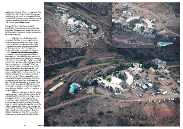
New feature for Idea Magazine issue #340 called Forms of Practice, interviewing young designers.
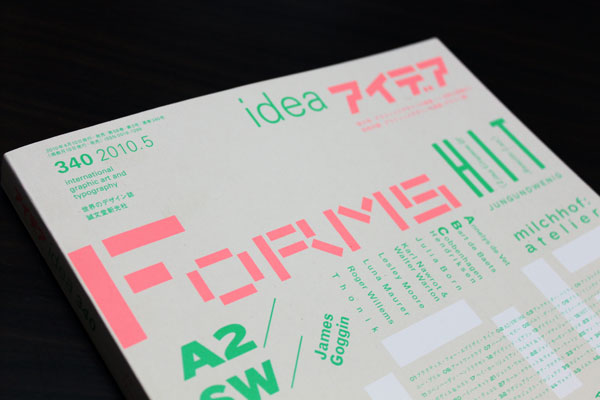
An excerpt:
Toward a new form of practice
A number of young designers in Europe and America are attempting to develop their own paths in exploring graphic design through innovative small-scale practices. Many of the designers featured here were born in the 1970s and 1980s, coming of age in commercial practice in the digital environment. The majority of those featured operate within the sphere of graphic design production from the approach of a more personal practice, inflecting their work with nuanced, idiosyncratic conceptual and formal approaches.

While widely varied due to cultural context and social/environmental differences, all have a kinship in unique approaches to developing formal options for clients. The use of the word “option” as applied here is perhaps the most relevant key point for the latest wave of graphic design from abroad- perhaps the “solution” as an end result of graphic design as a process is a dead methodology. What are instead offered are graphic “options” in lieu of “solutions”- inquiries answered with inquiries, questions answered with questions. The work featured offers playful, tentative answers instead of cold, hard end results.

This issue of Idea comes with a bonus satellite publication containing interviews with all of the designers and design studios featured in English and Japanese.


Foreword for a new book from Sandu Media called Mini Graphics, an exploration of small-scale graphic design projects.

An excerpt:
Go small.
Scale is a funny thing. Graphic design practitioners consider it daily on a relative scale- the size of a logo in relation to a business card, book title in relation to the size of a title page, or glossy button in relation to the size of the desired user’s browser. Beyond the design project itself, scale in terms of critically assessing professional practice is also valuable, especially in contemporary times- a juncture where there is such a variety of models as to what professional practice can be.

More and more, the boundaries of graphic design as a profession are widening. The potential of design as a small-scale, craft-centric practice that exploits the potential of on-demand production both in production and deployment has been more fully realized in the contemporary context. The main tool of contemporary graphic design- the personal computer- has become an increasingly affordable object to attain as of late and ease-of-use of this tool has developed more fully as computers themselves have become more sophisticated and powerful.

This tide shift in the technology and tools of graphic design and reprographics over the past decade is hugely important. Graphic design is an evolutionary process, and while it seems to move slowly to practitioners, it moves infinitely faster than other communication practices. These changes are both immediate and gradual, and they affect many aspects of graphic design- from process to product. Most immediately noticeable is how technology affects the final product. As evinced by the work in this book, graphics are no longer simplistic, unified brand signifiers rendered by previous generations. Designers today use broader palettes of color, form, space, and sheer methodology to achieve their results.

I have a number of projects featured in the book, including the identity design for my own design studio and identity projects for a handful of clients and collaborators.


I wrote a 10,000 word essay called “Heft, Gravy, and Swing: The Life and Times of Oswald Cooper” for the latest issue of Idea. The essay serves as the definitive biography of the Chicago type and lettering designer, famed for his Cooper Black typeface.

The essay is the result of a long-dreamed of trip to Chicago to sift through Cooper’s original drawings, scarce writings, and working papers. Copiously illustrated with proofs of Cooper’s work, unpublished typefaces, and photographs of rare design work, his legacy is brought into contemporary focus. New biographical information about Cooper, his work, and his associates is discussed within.

An excerpt:
Bertsch & Cooper was a visionary commercial art service. They were one of the first shops in Chicago that offered to create layouts, compose artwork, and typeset text all under one roof. They continually added staff, resulting in a scattershot assortment of illustrators, draftsmen, and compositors peppered throughout the same building in a variety of rooms. At their first location, Bertsch was famous for his “inter-office communication system” which consisted of yelling upstairs and down from the inner balcony of the building to professional associates. Cooper was ensconced in the “bull pen”- a room with a half dozen or so other commercial artists scratching away at the jobs of the day. Cooper was renowned for his “filing system”- a towering, dusty, haphazardly curved pile of layouts, proofs, notes, and other assorted papers that loomed over his desk, each day’s ephemera separated by a newspaper from that date.

This pile grew in relation with Bertsch & Cooper’s increasing roster of clients, which included a number of local Chicago businesses including doctors’ offices, legal firms, coffee shops, and banks, New York’s Marchbanks Press, the department store Marshall Fields, Strathmore Papers, Red Book Magazine, American Printer Magazine, and the American Institute of Graphic Arts. Cooper’s distinctive lettering can be found on a series of public service announcements for the United States government’s Food Administration, exhorting the public to eat less and conserve rations during World War One.

The article was jointly designed by myself and the Shirai Design Office, the esteemed designers of Idea.


On occasion, I write little reviews for CNNGo, CNN’s Asian Culture portal. None have made it to the main site in full form, due to the intentionally cheeky and unprofessional nature of the writing. A sample quartet of these posts are provided here for your entertainment.
Wakadaisho

Wakadaisho hosts a collection of vintage skateboard clothing, most exemplary being original Zorlac and Dogtown apparel. Occupying a musty retail space in Shimokitazawa, it’s a time warp for aging skaters.
There is a specific moment in time that Wakadaisho’s wares exemplify: the final days of skateboarding before hip-hop ran over it with a cultural truck. The clothing within the shop is a collection of late 80s skateboard brands- from the sanitary Powell Peralta skull-and—sword-laden imagery to Santa Cruz’s screaming hand imagery to the riskier edginess of Pushead’s stippled skating corpses for Zorlac. This shop is fraught with examples of a time when skateboarding was almost purely a punk rock pursuit, not urban swagger, oversized pantaloons, and Dr. Dre beats. The few skateboards that are within are fish-shaped, not the sanitized, ovoid wooden pills of today.
While much of this visual style has not aged gracefully, some elements have, and this shop is a resource for those interested in surveying the remnants of that time gone by- a time of pool skating, the birth of street skating, bad three chord music, and even worse attempts at creating a new genre of corporate-funded action sports-themed music, namely Thrasher Magazine’s brand of “Skate Rock”.
Along with the vintage skate gear is a sampling of vintage and retro blue jeans, Vision Street Wear sneakers circa 1987, contemporary skate backpacks, and tons of cell phone straps and keychains so integral to doing business in Japan.
Cafe Madu

“What with everyone carrying on about the greater Tokyo Burger Wars, one humble little chain of restaurants has singlehandedly beaten everyone to the punch by crafting the world’s finest BLT.”
I spent the bulk of last year’s Yokohama Triennale being hideously underwhelmed by the art within- the sole exception being Miranda July’s saucy installation in Yokohama’s Akarenga (Red Brick) warehouse complex. After checking that out, I found myself a wee bit peckish and decided to hit one of the restaurants nestled willy-nilly throughout the same warehouse.
Café Madu had a nice veranda, so I decided to give it a whirl. The English/Japanese menu had a fair amount of nice-looking offerings- the usual lunch sets with pasta, salad, and your choice of a beverage, but I eschewed those in favor of a BLT. Japanese BLTs tend to be made with thick Canadian bacon in lieu of North America’s crunchy, day-old normal bacon, making for a solid sandwich instead of a disposable snack.
What appeared before me minutes later was an inspiration- lightly grilled thick-cut bacon, fresh lettuce, a thin veneer of obviously handmade mayonnaise, and the tastiest white bread I’ve ever encountered, toasted to golden perfection. Eating that sandwich was a transcendental moment, it was so damned delicious. And it truly was a moment. I eat fast, frankly, but the sheer force of this sandwich brought about a primal state of ravenous, gleeful consumption rivaled only by sea salt butter caramel ice cream from Berthillon in Paris.
Café Madu’s BLT is the Reign In Blood-era Slayer of sandwiches. It hits you hard, fast, and unrelenting in its mission: to devastate your taste buds, leave your reeling, and just wanting more.
The Study Room

The Study Room is a science-themed shop for the curious child and his/her deep -pocketed parent(s). Young and old alike will be delighted by the broad range of scientific and pseudo-scientific buying opportunities within, guaranteed to be discarded within mere minutes by average children.
As a child, I was infinitely more interested in science fiction and it’s potentialities than any kind of hard science, with the exception being that of a possible future career as an astronaut. Being more of a dreamer than an egghead, those plans were laid to the side over time with a rich mélange of riding BMX bicycles, skateboarding, and listening to weird music taking prevalence over interstellar travel.
One girl that I went to school with was provided the opportunity of going to NASA’s Space Camp late in elementary school. To this day, I have never seen a human’s head become as swollen with self-pride as I saw that summer. This girl would lord her opportunity over us neighborhood kids’ heads all year, taking every opportunity leading up to and following her time at Space Camp to berate us with the details of the experience.
The following year, her folks hit a rough patch financially and in their marriage, and she was not able to go to Space Camp again. She was utterly devastated by her inability to float around in zero gravity, wear silver clothing, and feel so very, very special. This devastation led to her being pounced upon socially by the rest of the herd her age and resulted in daily tears on the school bus for months.
The Study Room’s pricey wares could have a similar effect upon your children, but they are very enticing nonetheless. Magnifying glasses, insect collection cages, skeleton replicas, geodes- all the ingredients for adolescent social leprosy are there for purchasing by the affluent parent with the desire to overcompensate.
Fruits Basket

This Shimokitazawa kids clothing and goods store has some of the best kids gear in Tokyo.
I’ve hit the magical age where ever-increasing numbers of my friends are procreating, both in Japan and abroad. While all good and fine, it means that the number of gifts that I am obligated to purchase for first-time parents is on the increase. With luck, my roaming around the environs of Shimokita landed me in a few decent kids clothing and accoutrement stores, though Fruits Basket stands out from the crowd.
Sometimes you just need a little something special for your friends’ imminent progeny.
For example, my friend Mort works as a garbageman (http://thankyoume.blogspot.com/) in San Francisco. Mort’s got a big mouth, a lot of charisma, and he lives in a fairly terrible ghetto in Oakland. He’s one of the only white people on his block, and as his wife is white, I assumed (properly, it turns out) that their first child would also be white.
I found the perfect shirt at Fruits Basket for their incoming offspring: a onesie bearing this dubious slogan in 120 point Futura, “I am a black man”. Perfect when paired with a sleuthily stunning extra-small Shelock Holmes-style cap for baby at a reasonable ¥4000 for both.
Morton now receives regular beatdowns on America’s mean streets as his child looks on in vaguely racist clothing. You too can live the fantasy.

A look at the script lettering of Miura Kōhei (三浦滉平).

A look at an outstanding piece of contemporary Japanese graphic design.

I wrote this essay for the Brand New School monograph, edited by Michael Worthington. Apparently the book is on permanent hold, so why not throw the essay up here?
School Days
The Brand New School projects that resonate most strongly with me are their network identities, in particular the identities for Fuel and the International Music Feed (IMF). Both work off of a modular kit-of-parts that incorporates a dynamic range of illustrative and graphic styles that mesh without an easy solution.
The Fuel and IMF projects feature terrific type design/type choices that work well for display on-screen, and are appropriately loud without being stupid—a rarity in graphic design for youth-oriented broadcast identities.
IMF’s mixture of Jens Gehlhaar’s Pretension Project typefaces, IBM-inspired cathode ray faces, pixel fonts, and project-specific typefaces is an eclectic selection that references multiple points in type design history: e.g., Excoffon, Rand, Crouwel, and more.
Fuel’s set of three preexisting and two custom typefaces is a study in poised crudity: The typefaces are always set in caps with default tracking, encouraging the most brute and effective means of making a typeface communicate.
The illustrative aspects of the Fuel identity are novel, in particular the use of buttons/badges as add-on bits of messaging that look slick and pop without going overboard. The range of illustrations on said buttons is diverse and connotative without being too specific—”a little bit country and a little bit rock ‘n’ roll”.
IMF’s amazing mix of illustrations by Clarissa Tossin really stands out. The visual languages of topographic maps, sonograms, musical notation, circuitry, technology, and nationalities are all explored in a myriad of ways. The BNS team has combined these assorted styles in a rich and densely layered approach that looks like nothing else on the air, yet remains quite obviously its work.
Color is considered in each identity in unique ways. Fuel’s post-punk black, white, and magenta is forceful, while the secondary colors applied complement the identity in a sophisticated manner. IMF’s approach to Otl Aicher’s palette is irreverent, with the inclusion of an arbitrary hot pink for added visual impact being the icing on the cake.
On the negative side, the iconography deployed for each identity is the sole weak point of each. The icons look mushy and forced—a bit too detailed for on-screen use, and feeling a bit like they were done in a rush. These aspects make the individual identities rely on the rest of the scheme to do the heavy lifting. However, as a whole, the identities are so strong that they do so effortlessly.
Fuel’s paint and ink textures, marks, and distorted grit add an air of exhilaration to the identity. In particular, when these elements are used as masks and wipes, they add another level of visual subtlety unseen in other network identities of a similar bent, target-wise.
The IMF logo lockup is a great nod to the isometric constructions of Takenobu Igarashi. The Parco-inspired logo’s animated assembly in space with a few camera angle changes is a sight to behold. It strongly connotes the ’70s with its Archigrammatic color scheme; thick, black outline; and accompanying Gehlhaar-designed, Antique Olive-channeling wordmark. Yet, simultaneously, the logo feels very present in the here and now through the mix of references.
Brand New School’s work is indicative of the tide shift that is happening in American television, which is becoming more interesting, engaging, and intelligent. At the same time, television executives are reaching out to incisive and insightful creative companies to help convey their broadcast identities. If I were one of those executives, there is no one else in the United States I would turn to other than Brand New School.

Foreword for Chinese publisher Sandu Media’s book on playful typography, Type Player. The essay discusses indigenous lettering styles and typographic experimentation. The book also features a few pieces of my design work.


Interview with curator and fine artist Hanna Fusihara Aron for Néojaponisme.

Short essay on the importance of 101 Tokyo, Tokyo’s young contemporary art fair for Néojaponisme.

Essay on Raymond Loewy’s contributions to graphic design culture in Japan for Néojaponisme.


Essay about the state of logo design in the contemporary graphic design field for Idea Magazine. I lucked out and got to design this section of the issue, as well.

An interview with Portland, Oregon-based printers and publishers Pinball Publishing for Néojaponisme and Viewers Like U.

Interview with the European type design collective Underware for Néojaponisme.

Interview with U.S.-based German type designer Jens Gehlhaar for Néojaponisme.

A series of mini-articles about 和英文字レタリング (Japanese and English Lettering) by Tsunetoshi Hurusawa on Néojaponisme.


Published by Pao&Paws in Taiwan, this book is bound in mauve, white, rose, or purple faux-crushed velvet covers.
Edited and curated by Joshua Berger and Imin Pao
In the age of digital typography a designer has literally thousands of typefaces available to choose from. 30 Essential Typefaces is a book focused on thirty of the most useful and functional typefaces in use today. The typeface selections were arrived at after questioning of design department chairs at RISD, Art Center, Basel, Yale, and St. Martin. In an era where fonts go in and out of style in months not years, these thirty typefaces stand the test of time.
30 Essential Typefaces collects leading contemporary design examples highlighting the usage of each of the typefaces. Each typeface contains historical information and specimen samples. The examples of usage vary greatly—and at times diverge completely from the type designer’s original intent.
Content includes essays by Cyrus Highsmith, Hank Van Assen, Wolfgang Weingart, Stanley Moss, Akira Kobayashi, and an interview with Matthew Carter. Featured works by Build, Lust, Chris Ashworth, Why Not Associates, Stephen Doyle, Margo Chase, Paul Sahre, Art Chantry, Rebeca Mendez, and others.
Within is also the results of an experiment I did by interpolating and combining all 30 typefaces, refining it into on globby piece of typographic PostScript muck. A brief essay I wrote accompanies the experiment.

Art Space Tokyo acts as your 272 page personal guide and interpreter, connecting you with the neighborhoods and figures behind some of the most inspiring art spaces in this colossal city.
Each of the featured spaces has been rendered as a striking illustration by Nobumasa Takahashi. The book covers art spaces in neighborhoods all over Tokyo.
The neighborhood surrounding each art space has been meticulously mapped with recommendations for the best food, coffee and sights to enjoy in an afternoon of art viewing.
I contributed an essay to this book which discusses graffiti artist Barry McGee’s influence on a generation of young graffiti writers working in Tokyo, and looks at the way in which graffiti articulates the urban environment of Tokyo.


Parallel Strokes is a collection of interviews with nineteen contemporary typeface designers, graffiti writers, and lettering artists around the world. The book is introduced with a comprehensive essay charting the history of graffiti, its relation to type design, and how the two practices relate in the wider context of lettering.
Interviews within include conversations with pan-European type design collective Underware, Japanese type designer Akira Kobayashi, American graffiti writer and fine artist Barry McGee/Twist, German graffiti writers Daim and Seak, American lettering artist, graphic designer and design eductor Ed Fella, among others. Parallel Strokes is an enquiry into the history, context, and development of lettering today, both culturally approved and illicit.
Parallel Strokes spun out of my CalArts Graphic Design MFA thesis. I designed and self-published the book in 2008 after years of intermittently writing it and collecting visuals.
The book was released via my publishing imprint, Wordshape, in an edition of 1000 and sold out within a few months. The 240 page book was printed with a one-color interior on matte paper with a metallic 3-color UV gloss cover.
I also designed and released a number of promotional items for the book’s release. These included canvas tote bags in 2 color options, a blue/blue split-fountain screenprint and a magenta/Rubine Red split-fountain screenprint. I also designed a two-color 18″ by 24″ poster that featured the entire book laid out in thumbnail format. With a magnifying glass, one wasn’t required to buy the book- you could just squint and read the poster.
Though sold out, you can still see the Parallel Strokes website here.

Lengthy essay titled “Gary Hustwit’s Helvetica” about the independent director’s hit documentary on the history and social impact of the typeface Helvetica.
Excerpt:
“Experimental Jetset and British designer Michael C. Place are held up as the purveyors of the return to rational functionality in graphic design, in particular through their use of Helvetica. Danny van den Dungen, one of Experimental Jetset’s three principals discusses the practice’s work and their return to a reliance upon Helvetica as both a style and a step in the evolution of Modernism. van den Dungen opines that this return to the high modern style (though paired with pop colors and more radical grid constructions) logically follows the free-for-all deconstructive tactics of David Carson and Emigré, while simultaneously embracing the culturally resistant attitudes of early Modernism and functional aspects of late Modernism. He speaks of the use of the Modern design language as being part of the Dutch design continuum, and that what they are doing is merely (yet quite consciously) expanding upon the visual language of their country of origin. In all, it is a logical discussion of contrasting ideas and idealogies that makes his approach very convincing. Michael Place discusses Helvetica from a primarily stylistic viewpoint – his work is highly influenced by the work of Swiss International Style high priest Josef Müller Brockmann – and when he discusses the large-scale identity projects that he desires, it from the launching point of “Wouldn’t that be cool?!”, not an essential, unified approach to corporate identity. Surprisingly absent from this section of the film is an interview with the members of Japanese design firm Groovisions. Groovisions reliance upon Helvetica and influence from Müller Brockmann’s work stands as the third most popular illustration of contemporary graphic designers using these same visual tropes in contemporary practice. The Tokyo-based company operates from a similar perspective to Place’s, of Modernity as style, not ideology, and their more current design work is starting to stray more and more from their old reliance upon what had become a default template of Modern artifice.”

Lengthy essay about the film Beautiful Losers for Idea Magazine that explains the cultural context and ramifications of this group of artists’ work.
Excerpt:
“Beautiful Losers is an American documentary directed by Aaron Rose and Joshua Leonard. The film primarily focuses on the group of artists, designers, and directors whose work was exhibited at Rose’s former gallery, Alleged, which existed from 1992 to 2002 in New York City. They were a loose-knit group of similarly-aged peers whose interests in skateboarding, punk, graffiti, hip-hop and an overriding collective interest in D.I.Y. artistic pursuits, both fine and commercial, brought them together. Alleged Gallery played an important part in hybridizing the two approaches: fine art and graffiti being introduced to global audiences and graphic design being introduced in a gallery context.”

Lost is a special-edition book that celebrates 10 years of documenting graffiti and visual culture in Los Angeles. It features previously unpublished material as well as highlights from the long out-of-print first 12 issues of this highly acclaimed publication.
Among those featured in this book are pioneers such as Tempt, Yem, Besk, and the MAK crew; artists influential in shaping current L.A. graffiti culture including Ayer, Atlas, Cab, and Hael; and visuals by street art innovator The Phantom, photographer Luna One, and artist Patrick Martinez.
Two on-going Lost sections are presented in this volume as well; the Lost Blackbook Project which collects material from writers’ sketchbooks that gives a unique look into the graffiti process; and Contrast Resolution, a visual exploration of the impact of graffiti on the streets of L.A.
Eyeone provides the introduction as well as an overview of issues past, and Ian Lynam rounds out this volume with a foreword that puts Lost in the context of graffiti, typography and design.
Contents:

Edited by FontShop co-founder Erik Spiekermann and Dutch writer/designer Jan Middendorp, this book showcases the history and influence of the award-winning foundry. The book is replete with real-world examples of FontFonts in use, from high-profile ad campaigns for big automakers and fast food giants to iconic poster designs for the Tyson/Tubbs heavyweight battle in Tokyo and New York’s Shakespeare in the Park. They even threw one of my business card designs in there.
“Made with FontFont” includes art and articles by Strange Attractors, John D. Berry, Peter Bilak, Neville Brody, Susanna Dulkinys, Eboy, Rian Hughes, Max Kisman, Akira Kobayashi, LettError, Ellen Lupton, Martin Majoor, Albert-Jan Pool, Paula Scher, Christian Schwartz, Nick Shinn, Fred Smeijers, Studio Dumbar, and xplicit.
An interview that I wrote a number of years ago for Font Magazine (my inaugural piece of graphic design writing!) is included in the book- it’s an interview with Bay Area FontFont type designer and nice guy Alan Greene.
“Made with FontFont” is a companion to “FiFFteen”, an exhibition celebrating FontFont and FUSE. The show has been traveling internationally, with previous stops including Barcelona, Berlin, Helsinki, London, and New York.
Hardcover, 352 pages, color illustrations


Cover story for Issue 5 of FontShop International’s magazine Font, “Ill Legible:Traveling the Paths of Urban Pioneers”.
This 7 page essay charts the development of graffiti from the context of lettering and calligraphy while grounding the practice within modernism.
This issue of Font is sold out. You can download a pdf version of the feature article I wrote about graffiti for that issue here. Please download it to conserve bandwidth, as opposed to opening it via a browser- it is print-resolution and will take ages to view in a web browser.
Interview with Alan Greene, designer of FF Atma. See it here.


