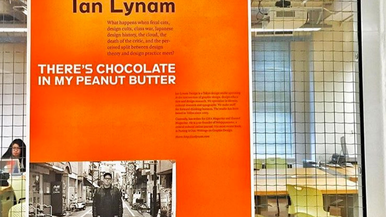
It’s been a while since the last update — the Kickstarter campaign for my new book Parting It Out, a collection of essays about graphic design and culture, came off without a hitch and the book was successfully funded. The whole experience was pretty amazing, and I documented the entire campaign using Kickstarter’s Updates section of the project — you can read the greater narrative here. Within, there is a ton of writing, links to recent presentations, a free ‘zine of Japanese signage, and a whole lot more. (Hate that this website is still not responsive? Read it here on Medium.)
A number of people, notably professional and academic colleagues, have asked me to share my advice about running a successful Kickstarter project since my project was funded, so I have put together a short list of suggestions here for folks even considering undertaking a campaign. Some of it is practical, some of it is pragmatic, but hopefully all of it is helpful in one way or another.
1. Homework.
Read this: http://craigmod.com/journal/kickstartup/. Know what you are getting into and how you might approach it. There is a ton of writing about crafting successful Kickstarter projects online, but none has had the grace, poetry, and applied thinking as Crig’s essay on the topic to date.
2. Kickstarter campaigns take a lot of time.
You’ll need at least 20 hours a week to work on your campaign. (I spent 50 hours per week.)
Why? Because there is all of the stuff that you will need to be doing in the background that makes for a successful campaign, notably:
A. Reach out.
Bugging every single person you know to share the campaign with their networks (which is the non-creepy way of asking people to indirectly back your campaign)…
B. Platforms.
…this means: Twitter messaging, Facebook messaging, direct emails, phone calls, physically intimating that friends might want to back your project, and calling good ol’ Mom and Dad.
C. Blasters set to “stun”.
Writing newsletters and using a service like MailChimp to deliver them—do one at the start of a campaign, one at the mid-point, and one a few days before the campaign ends—my campaign suffered because I didn’t do one final email newsletter. “しょうがない”, as they say in France, but I surreptitiously kick myself for it daily.
D. S-T-R-E-T-C-H.
Thing about stretch goals before you launch! I fucked up on this, and the stretch goals weren’t appealing to everyone. KNOW what you are offering people going in, and say it!
E. Use everything.
Collect every piece of possible PR you can get and deploy them, i.e.:
Ben is not a “famous” graphic designer (note: fame is extremely relative in graphic design), but I love his work, he’s a great guy, and I believe in him. Bonus: his Facebook post is honest and funny. Use every little thing you can get your hands on! (And be appreciative when folks help you out! Thank you, Ben!!!)
F. Make content early.
Before you launch your campaign, go absolutely crazy in terms of following as many people on Twitter as possible that are somehow vaguely related to your focus/campaign goal and delivering one piece of strong, original content daily that is completely unrelated to your upcoming campaign, then retweet at least one thing that you really think is smart/interesting/engaging daily. Be interesting! (Note: I only kind of did this, but it makes sense how it will help in terms of audience engagement. I was a super-slack Twitter user before, but I see the power of it now. Sounds so 90s, but it’s true! Do your due diligence prior!)

3. Editorial tone.
For everything, manage *how* you are saying what you are saying—use “I” when needed, but try and use “we” as much as possible—the collective “we”—what are people going to get out of backing your campaign? For example, look at all three of the 99% Invisible/Radiotopia campaigns—the voice that they used was a rallying cry and made their campaign super-successful!
The best written language is akin to spoken language—I just wrote the way that I write and it was all honest and came from the heart.
I also did what I tell all of my grad students to do—grab your phone and talk what you want to say into a mail or memo to yourself using iOS’ voice recognition/dictation feature. You’ll get to the end goal so much faster, and it will sound like you, not you typing.
4. Friendliness.
Check out Frank Chimero’s The Shape of Design Kickstarter to see how to do things right. I am of the opinion that each individual only really gets one chance to do a big Kickstarter before alienating their personal network (unless they figure out a really smart way of positioning a different project really well). Make your campaign as inviting as possible!
5. It takes a village.
Don’t rely on just that one person with an amazing social media presence who you are indirectly connected to to help out with social media—reach out to as many people as possible. I lucked out in that Ilovetypography shared the campaign and a whole bunch of folks I don’t know jumped on-board. Without that, and Adrian Shaughnessy’s plugs, and Stefan Bucher’s plugs, and the hundred-or-so type designers who shouted out the project, and everyone at VCFA‘s shares, I’d have been sunk.

6. Personalize your news
If a ton of folks back your campaign, it is very hard to thank each person individually via updates (though it’s natural to thank everyone individually via Kickstarter’s message center), so be sure to shout out individuals’ contributions when hitting benchmarks. I thanked most individuals who contributed to getting us to every new thousand dollar-mark after the initial flurry of activity that most campaigns experience. This just fed further activity in the campaign, helped support a sense of community, and got people individually invested in the campaign. The dude that got us to our $25K mark, the inestimable Erin Lynch, was an early backer of the project, but he felt personally invested in the campaign and upped his contribution to ensure we hit our goal.
Never underestimate the power of individuals. I said this in Update #12, but it’s a really valuable takeaway:
A community is a local economy.
Never underestimate the power of this.
6. Don’t sink.
Kickstarter/Amazon are going to take 8% of your campaign money. Think about how much money you actually need for this project, then add a third of that at the very least. Printing for my book is going to cost around $15,000—$17,000, and frankly, I am not sure how much the poster printing and shipping is going to cost, but I made sure to pad the numbers so that everything will be covered safely (and by that, I mean that there is an extremely slight margin of error—I won’t be going to the Bahamas on other folks’ money).
The worst case scenario for me was if the product was only partially funded. I had enough available cash to cover it if I needed to, and my wife would have used her bank account to put the money in. Have a backup plan if your project is going to potentially be under-funded. Think about cost/risk and what you can do if things don’t go super-well. It seems shitty in terms of ‘gaming the system’, but a lot of people do it.
This all being said, I was fortunate enough that I didn’t have put any money into the Parting It Out Kickstarter campaign—I worked my tuckus off to get the word out (sweat equity!), and I am lucky enough to have a support network that funded the project. I am going to make this book as sick as possible in order to ensure that every single person who backed it feels like they got their money’s worth and that the rewards truly freel like rewards!
7. P.R.
A Kickstarter campaign is great for funding, but even better for PR—it really helps get a project a ton of PR. I approached it like that initially, and when it grew legs and started to seem truly viable (which was pretty much overnight), I switched my communications to being a bit more sales-oriented. At the absolute least, how can you effectively communicate and convey your project to as wide-ranging an audience as possible (without being annoying).

8. Be general.
My campaign suffered because it was for a specific book. If I’d pitched it as starting a new design publishing company, I’d probably have gotten ten times the funding that I did. Kickstarter as an entity gets behind projects that are more general in scope. A book of design criticism is so laser-focused that they threw me a bone by putting my project on the Design search results page for 2 weeks, but only because it was a project from Tokyo—probably not because of the actual content. How might you rewrite your project to appeal to a more wide audience?

9. Live live live.
Do as many presentations to as many different audiences as possible. I did 3 presentations at 3 very different events, and people jumped onboard because of it. There were significant spikes after each one—social media alone will do it, but by doing a presentation and making a video of it, you can use that as further PR/content for your Kickstarter campaign. I had a friend record one of my presentations and edit it, then I put it up on YouTube and Vimeo. (It got about 100 plays, which while not huge, really helped.)
10. Catch and release
Time-release content from your project, or curate ancillary content. Give them as thank you gifts. Throughout the campaign, I included excerpts from my book. This got people even more interested and invested.
I released Moji no Hakkutsu / 文字の発掘, a small, as-yet unpublished zine of photos of vernacular signage, lettering and street typography in Kyushu in the south of Japan, as a thank you gift to *everyone* who contributed to the campaign—backers and folks who shared the campaign alike. You are invited to download it here in one of two formats:
Moji No Hakkutsu by Ian Lynam / Screen
Ebook spreads version – perfect for tablet or desktop viewing – low resolution! 4.3mb PDF
Moji No Hakkutsu by Ian Lynam / Print
Print imposed version – you can print this out as a double-sided booklet, fold and staple! – print resolution! Zipped. 4.2mb PDF
There’s something that just feels good about showing thanks to the world for supporting your project—and that goodwill will come back tenfold. I’m more interested in thanking everyone, because I have more than a few friends who shared the project, but for a number of reasons couldn’t back it. I just appreciate everyone’s support.
11. Identity.
Give your campaign an identity. I very intentionally used one typeface, 3 colors, and made everything feel extremely branded. Set up a scheme of visual mnemonics to hang your campaign on. You’ll be happy you did, because people will remember it.
12. Leverage.
What famous people or at least infamous people can you get on board to help out in terms of PR? Having YACHT Tweet about my campaign helped so much, as did getting my pal Evan Mast from Ratatat to agree to let me use some of his unreleased music for the Kickstarter video.
13. Don’t rush.
I thought about this campaign for a year and a half before jumping in. If I were to do it again, I’d do a lot of stuff much, much differently. Consider every possible facet and come up with a total media plan.
14. See what other folks think!
The great thing about Kickstarter is that you can draft your campaign and share it with advisors before you launch. I tweaked mine to death over the course of a month(!) before launch with input from a half-dozen people who are excellent designers, marketers and writers. This is helpful from the perspective of launching a carefully-crafted campaign, as well as creating a handful of advocates who will immediately go to bat for you and who will continually share the project and back it over time, as they will see it as part of a collective project. (‘Sup, AQ!)

15. Family.
Get family onboard. Families want to see their members’ projects go well. The picture above is me, vaguely drunk, presenting at PechaKucha Night in Tokyo, pointing out the folks who have backed the project, but the folks inside the magenta circle are the most important ones: my amazing mom and dad. They gave what they could, as did my mother-in-law and father-in-law, my amazing nephew, my wonderful cousins, and a number of other family members. Nothing makes you feel better than knowing that people closest to you support you and your vision.
So, that’s pretty much it. The Updates in the Kickstarter campaign itself also have a ton of advice embedded, as well—in particular, the last one, which features some great advice from Craig Mod, my good friend and mentor for the journey. It was a long, strange month but I am really glad I partook in this Kickstarter campaign—I learned a ton, and most of it was wildly unexpected… which is how life should be.
On to other news…
I wrote an essay for Red Bull Music Academy about the life and times of the late graphic designer Barney Bubbles. You can read it here.
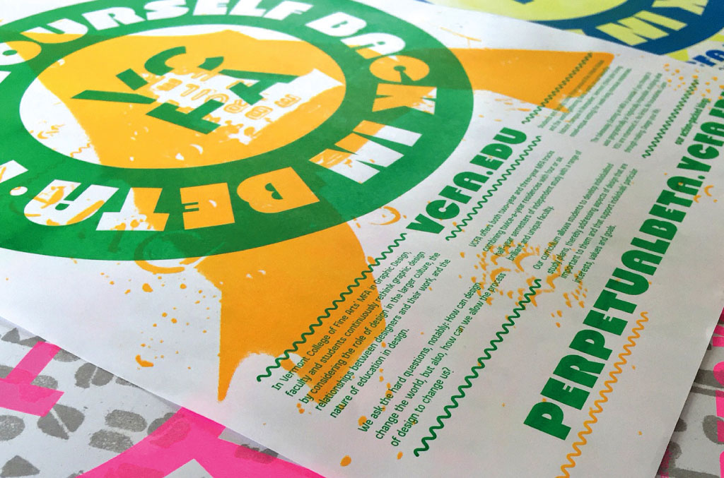
We launched Perpetual Beta, the new blog for the MFA Program in Graphic Design at VCFA, the program which I co-chair along with Silas Munro. We’ve spent the past few months putting this together, and I am stoked that it is out in the world! Check out the magic within—tons of graphic design essays, mind-blowing visual work, and interviews with faculty and critics associated with our university.
I have a new essay called “Weddings” published in Modes of Criticism 1, edited by Francisco Laranjo and featuring essays by Randy Nakamura, Cameron Tonkinwise, Kenneth FitzGerald, and others. The raison d’être for the book is best put by Francisco himself:
At a time when it is fundamental to be critical, the word has become ubiquitous, cool, vague and open for debate.
Upcoming: I will be giving a lecture and workshop for the Society of Childrens Book Writers and Illustrators’ Japan about typography and narrative in Omotesando on May 8, 2015. The lecture and workshop will be open to the public (¥1500 for non-SCBWI members), and it’ll be worth it! I’m going to be bringing a big box of vintage Letraset and we’ll be doing some manual typesetting fun together!


 While I was writing Species Regret, I came up with the idea for another publication, titled Start Somewhere: A Handbook of Dubious Exercises, Tips and Rants About Becoming A Designer Who Writes. I had just returned home from teaching in Vermont and met with a ton of students who were having the hardest time generating their own content. Start Somewhere is my attempt at suggesting how designers might create work of their own—projects which involve design and writing, but that are fun, goofy, and insanely personal.